Prevent CSS hover on touch devices
April 13, 2020
ISSUE
모바일 웹에서 호버 효과가 발생하는 이슈가 있다. 모바일에서 그게 가능한 것일까?라는 의문이 들 수도 있다.
머릿속에 떠오른 일반적인 호버 효과는 당연히 아닐 것이다. PC에서 hover effect를 적용한 tag를 모바일 웹 환경에서 터치 할 경우에 호버 효과가 발생한다. 문제는 호버 effect가 계속 유지된다는 것이다. 문제는 호버가 아니라 active효과처럼 다른 영역을 클릭하지 않는 이상 사라지지 않는 다는 것이다.
더더욱 toggle 기능을 하는 버튼의 경우에는 골치가 아프다.
해결 방안
역 논리를 사용하여 모바일 브라우저가 hover 효과를 전혀 유발하지 않도록하는 미디어 쿼리를 구성할 수 있다.
The pointer CSS @media media feature can be used to apply styles based on whether the user’s primary input mechanism is a pointing device, and if so, how accurate it is.
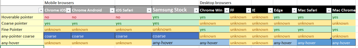
모든 모바일 브라우저는 인식하지만 PC브라우저는 포인터를 인식하지 못한다.
- HTML
<div>
  <!-- Should not trigger on touch device -->
  <button>Hover me without touching please</button>
</div>- Sass Mixin
@mixin hover-supported {
    @media not all and (pointer: coarse) {
        &:hover {
            @content;
        }
    }
}
button {
    background-color:gray;

    @include hover-supported() {
			background-color:white;
    }
}- compiled css
button {
  background-color: gray;
}
@media not all and (pointer: coarse) {
  button:hover {
    background-color: white;
  }
}
DEMO
Try it out here! https://codepen.io/programmerper/pen/XqmWGP. Also described in this gist.
참고:
![[Ju Chan Hwang]](/static/834c8c2199bc201e56564b7b5af123a2/a12fc/profile.png)